There’s something deeply satisfying about taking a huge amount of data and turning it into a gorgeous, easily understandable, educational graph. Presenting vast swathes of info in a way that everyone can understand is an incredibly skill.
The team behind the ‘Information Is Beautiful’ project are masters of data visualization, showing you the world in ways you might not have seen it before. Today, we’re featuring some of the intriguing graphs and diagrams that they’ve shared online to show you fresh new perspectives. Scroll down to check them out. And if you love what you’re seeing, be sure to visit their site and follow their socials for more.
We has reached out to the ‘Information Is Beautiful’ team via email to learn more about their awesome project, and we’ll update the article as soon as we hear back from them.
More info: Facebook | Instagram | X | Books | InformationIsBeautiful.com
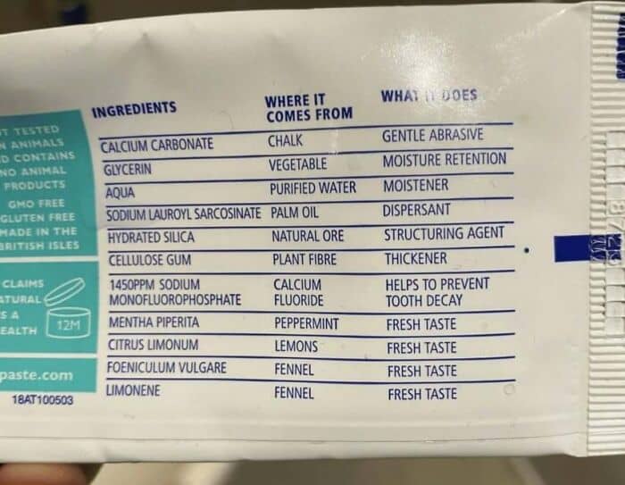
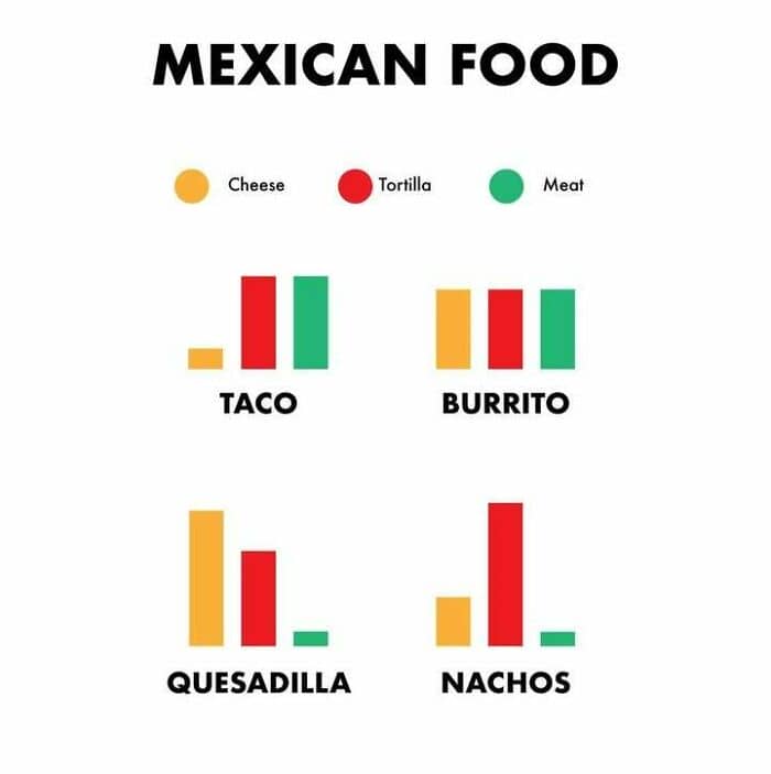
#1 Truthpaste! Love This Labelling – Let’s Roll It Out Across All Products
#2 Har Har Yes
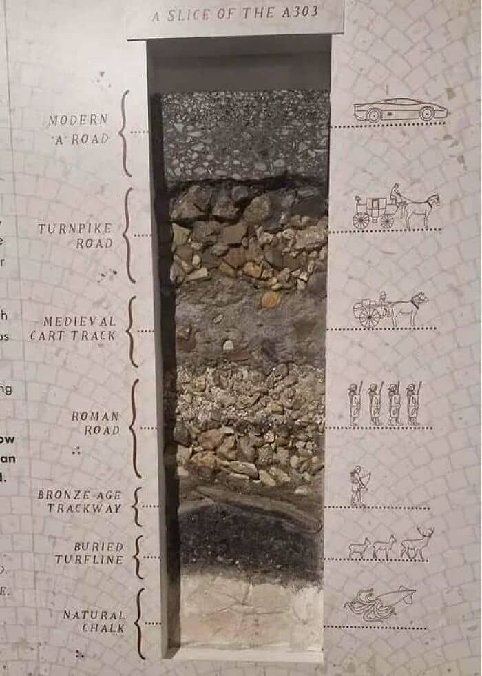
#3 Revealing Cross Section Of A Road In England
‘Information Is Beautiful’ is the brainchild of David McCandless. He is the author of three best-selling infographic books:
Knowledge Is Beautiful: Impossible Ideas, Invisible Patterns, Hidden Connections – Visualized;The Visual Miscellaneum: A Colorful Guide to the World’s Most Consequential Trivia;And—most recently—Beautiful News: Positive Trends, Uplifting Stats, Creative Solutions.
The founder has also spoken at TED Global, as well as at 200+ conferences and events. What’s more, he runs the startup VizSweet, “a lovely artisan tool for creating beautiful interactive data visualisation.” McCandless, along with his dedicated team at ‘Information Is Beautiful,’ aims to explain, distill, and clarify data, information, and knowledge into beautiful and useful graphics and diagrams.
#4 Beautiful Elevation Art
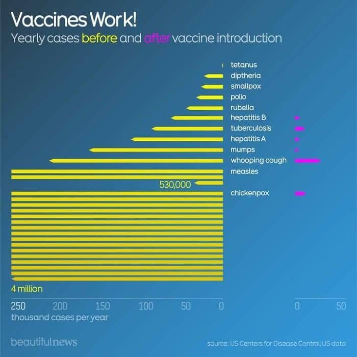
#5 Because Vaccines Work
#6 Most Offensive Types Of Pillow Cases

According to the team running the project, all of their visualizations are based on facts and data. They constantly update and revise them. McCandless and his team members actually mostly create their graphics by hand, using the Illustrator program (a personal favorite of some of us, too).
Meanwhile, many of the interactive data visualizations they make are actually created using their proprietary VizSweet software.
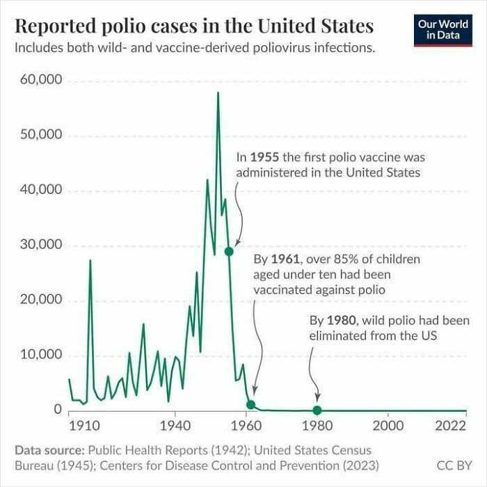
#7 In The First Half Of The 20th Century, Tens Of Thousands Of People (Mostly Children) Suffered Paralysis From Polio. The First Vaccine Was Introduced In The USA In 1955
#8 True? True
#9
Something else that’s mindblowing is that the founder of the project, McCandless, actually made The Helicopter Game. It’s something that we’ve played and thoroughly enjoyed during breaks in between IT classes at school.
At the time of writing, the ‘Information Is Beautiful’ Facebook page boasts 531k followers from all over the globe. Meanwhile, 232k social media users follow the project on Instagram, while another 119k do so on X (formerly Twitter).
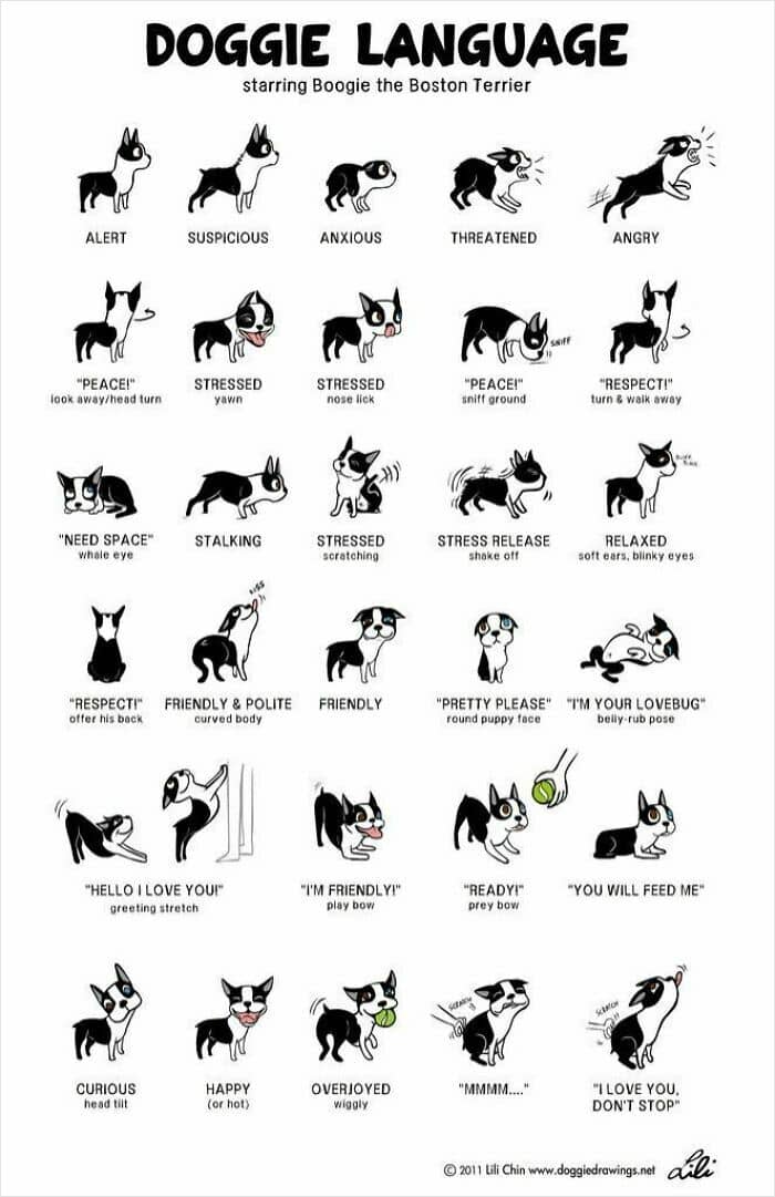
#10 Lovely Chart Of Doggie Body Language
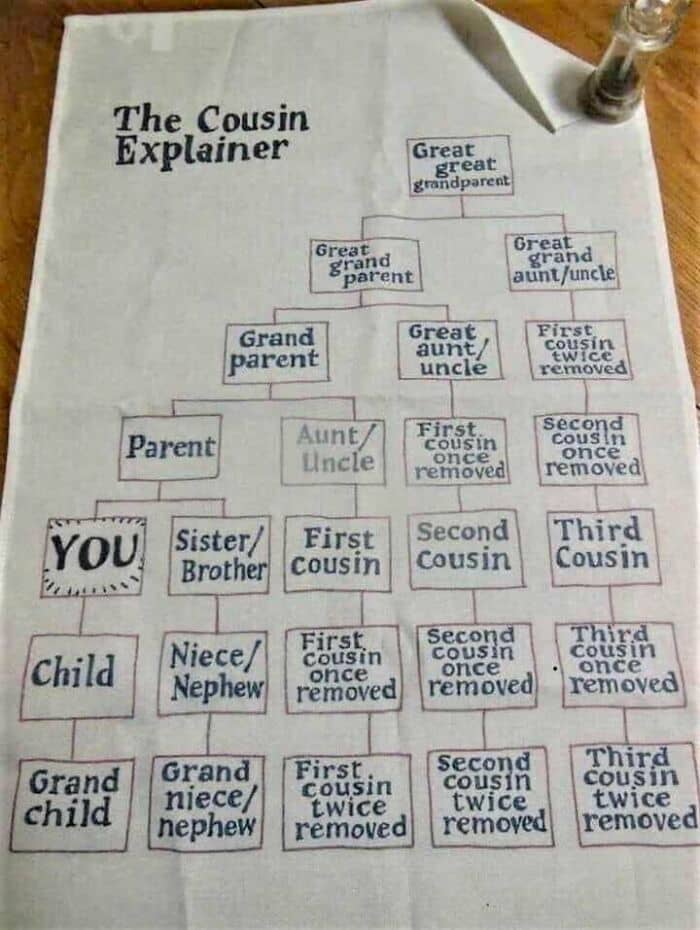
#11 Wait, Who Is My Third Cousin Twice Removed? Oh
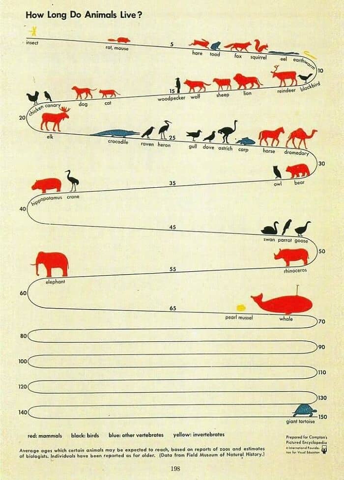
#12 Classic Isotype Infographic From The 1940s
With so much information flooding our social media and news feeds daily, it’s impractical to double-check and cross-reference every single bit of info we stumble across.
So, it’s much more time-efficient to evaluate the reliability of the sources you come across. Although all sources, even the best ones, make mistakes, not all sources are equal.
Reliable sources do their best to get to the truth, link to the info they use, and make corrections whenever they slip up. On the flip side, bad sources care only about sensationalism, clicks, and moving whatever agenda they have further.
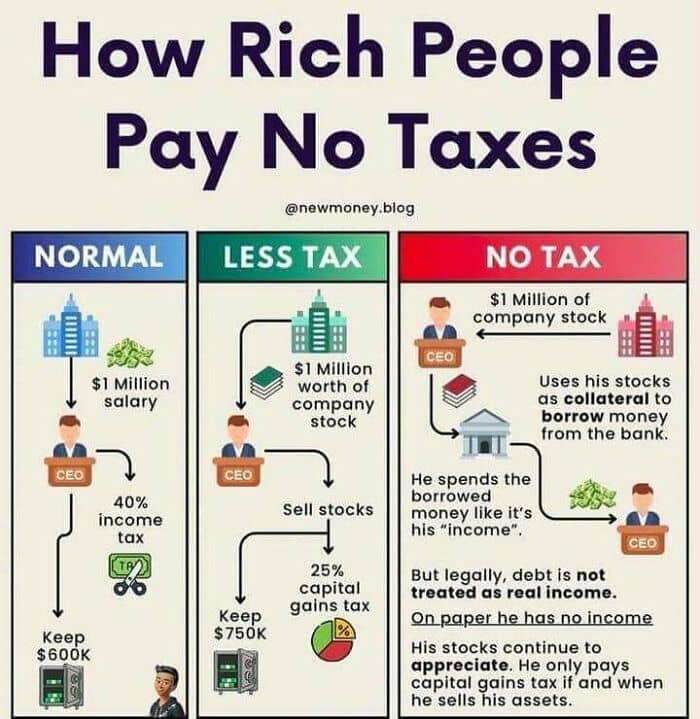
#13 How Rich People Avoid Paying Tax
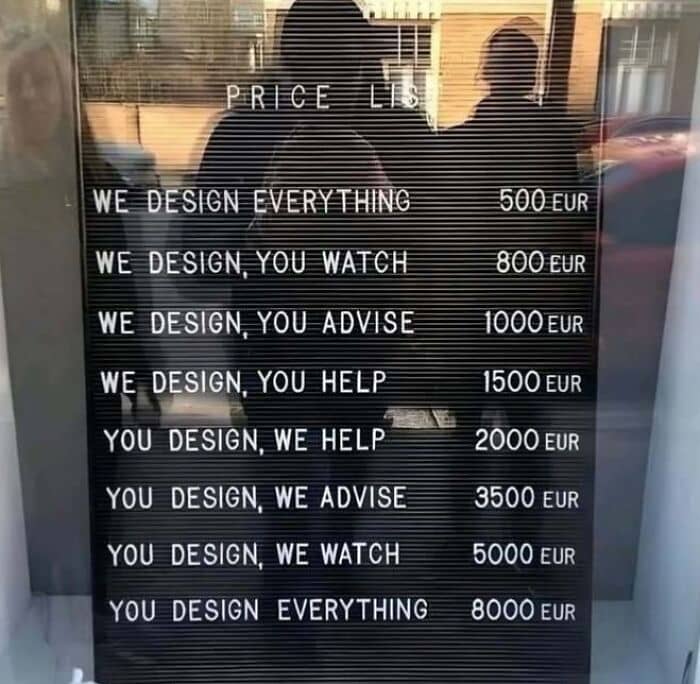
#14 Design Costs
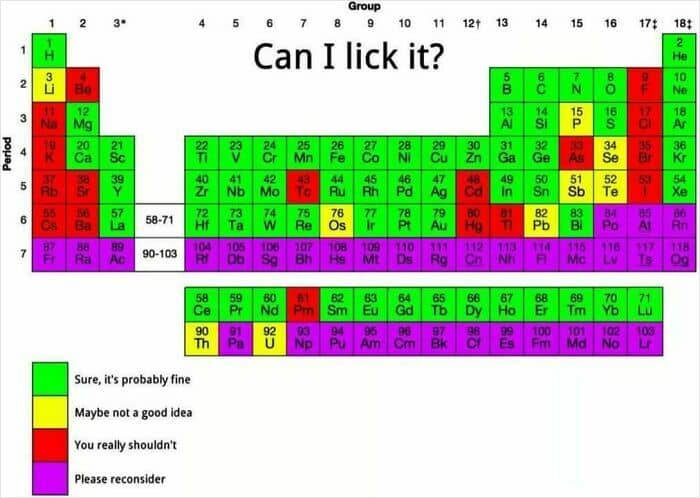
#15 Periodic Table By Lickability
Basic media literacy and the ability to recognize (un)reliable sources are skills that absolutely everyone should have. In this day and age of scandalous headlines, intentional misinformation, polarization, biases, and AI slop, there are so many ways to misinterpret information and mix up fact with fiction.
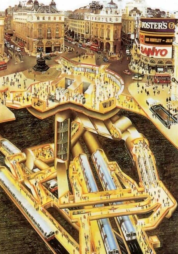
#16 Love A Revealing Cut-Away! (From A London Transport Museum Poster By Gavin Dunn)
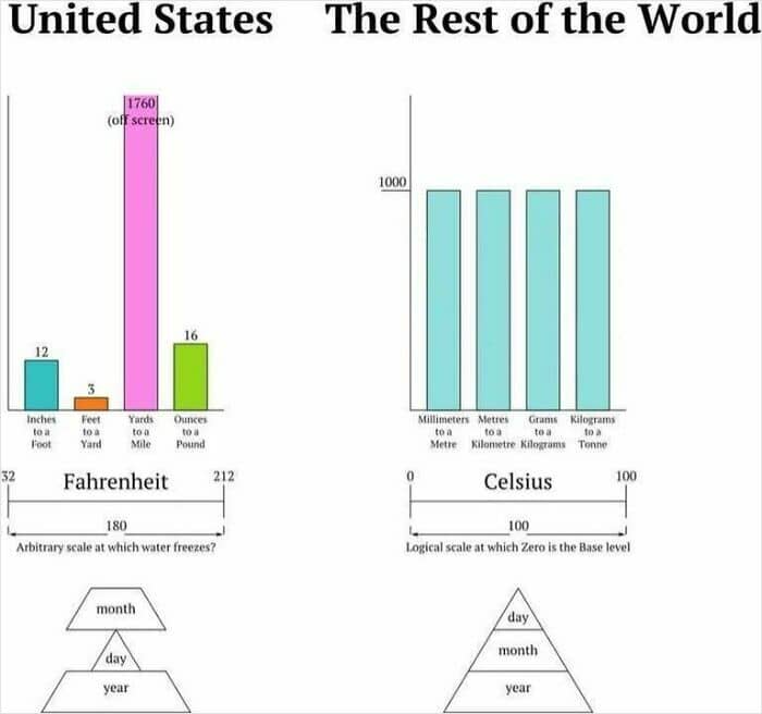
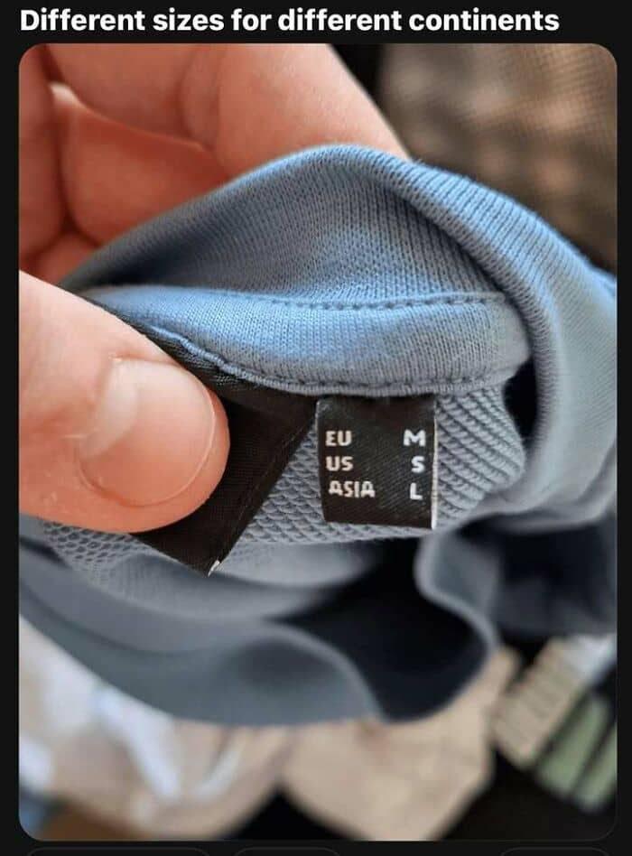
#17 Measurement Unit Differences Between The U.s.a. And Most Of The World
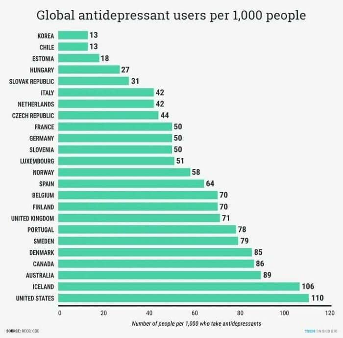
#18 Global Antidepressant Use
A good rule of thumb to keep in mind is to always consider what the source you’re looking at might be hoping to accomplish, and what their intentions are. According to archival expert Margot Note, you should ask yourself the following questions when gauging the reliability of a source:
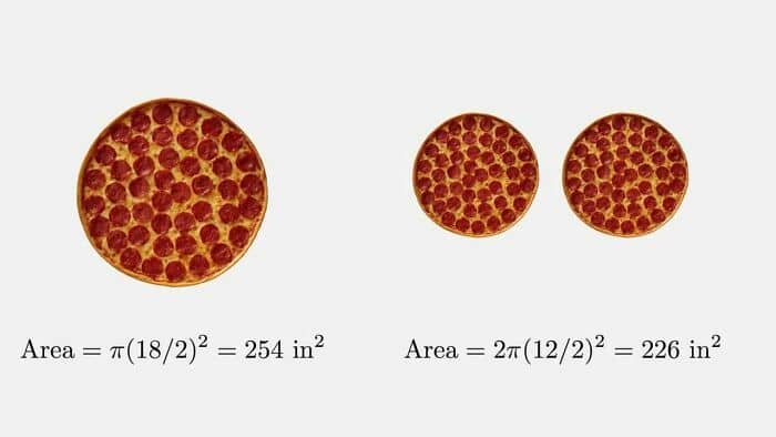
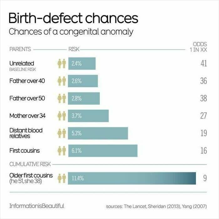
Who made the record? When did they make it and why?Was the source actually created at the same time as the event that’s described in it?Does the source have an agenda, and did they take part in the original event, or are they using secondhand info?Is the information logical? Does it make sense in the context of the people, places, and timeframe being researched? #19 One 18 Inch Pizza Has ‘More Pizza’ Than 2 X 12 Inch Pizzas!
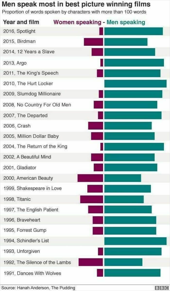
#20 Telling. Quantity Of Male Versus Female Dialogue In Best Picture Films Of Recent Decades
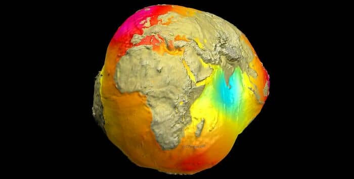
#21 May I Present To You, The Potsdam Gravity Potato? Areas Of The Earth Where The Gravitational Field Is Mysteriously Weaker (Blue) Or Stronger (Orange)
Broadly speaking, information that is overly sensational and plays on your emotions is likely to be misunderstood by the person, biased, or even outright wrong. If something sounds too good or bad to be true, it likely is.
Real life is rarely—if ever—black and white. It’s nuanced. It’s subtle. It’s full of shades of gray and complexities that can’t be explained away so easily.
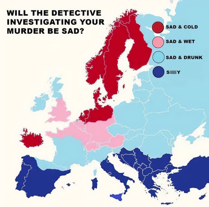
#22 What Mood Will Your TV Detective Be In?
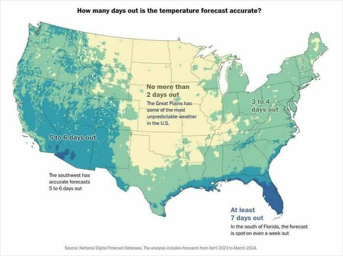
#23 How Reliable Is The Us Weather Temperature Forecast? Didn’t Know That About Florida
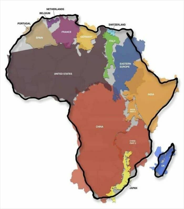
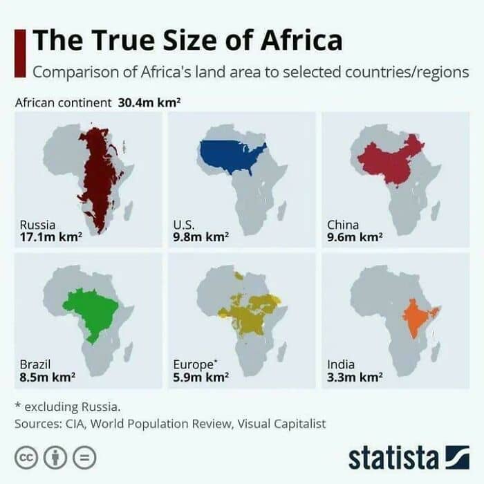
#24 Africa Is Big
According to the BBC, there are 3 main things to check for when you want to find out whether a source is reliable or not:
Check who made the claim. Dig into the person or organization’s background and previous work to see if it’s accurate and unbiased;Check multiple sources to see what conclusions they come to. Having more sources report the same info increases the likelihood that a claim may be true;Check for reliable evidence. Look at the information that the source is using to back up their claims.
“It’s also good to ask yourself if what the source is saying sounds believable. If it appears a bit out of this world or too good to be true, then the chances are that it might well be,” the BBC writes.
#25 Yet Another Reason To Tut At The Mercator Map Projection

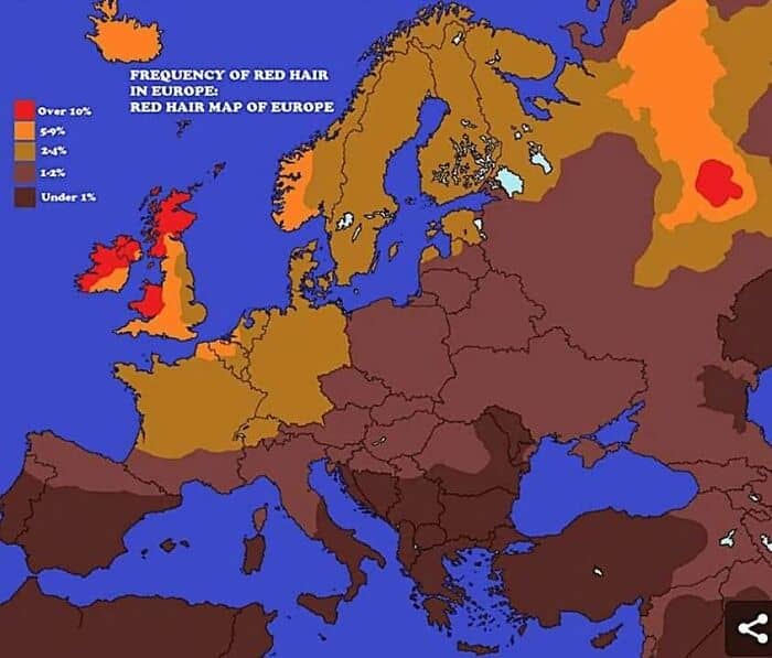
#26 Frequency Of Red Hair In Europe
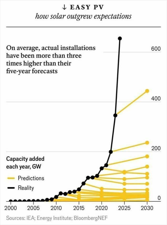
#27 The World’s Solar Capacity Reached 1,419 Gigawatts In 2023, Way Beyond Any Predictions. 1 Gigawatt = Power For A Medium Sized City
Are you big fans of interesting graphs and cool visual data design like we are, dear Pandas? Which of these graphics impressed you the most? What’s something new that you learned today, all thanks to these visuals? Do you typically prefer look at graphs or maps? We’d love to hear your thoughts.
So, if you have a moment, swing by the comments at the bottom of this post to share yours. Oh, and don’t forget to check out the ‘Information Is Beautiful’ site and socials for their latest awesome stuff!
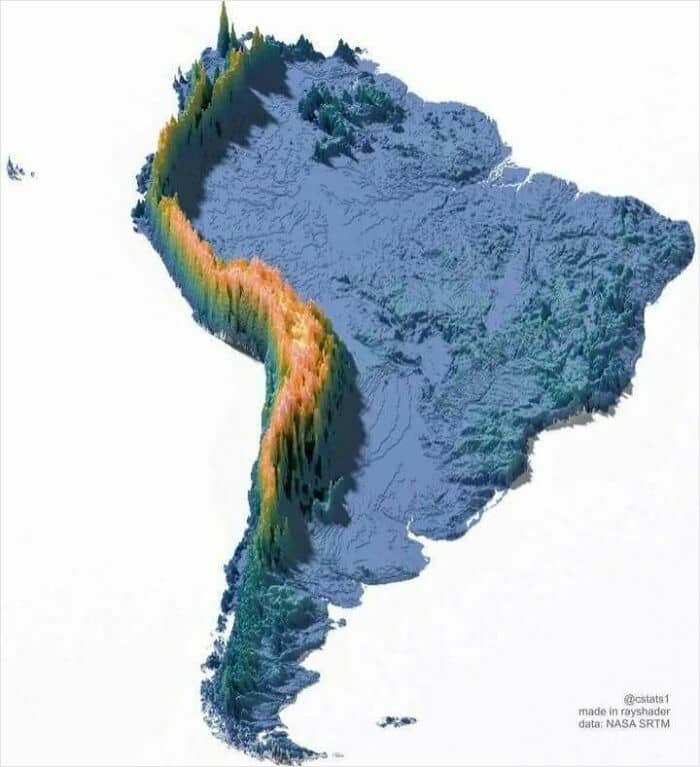
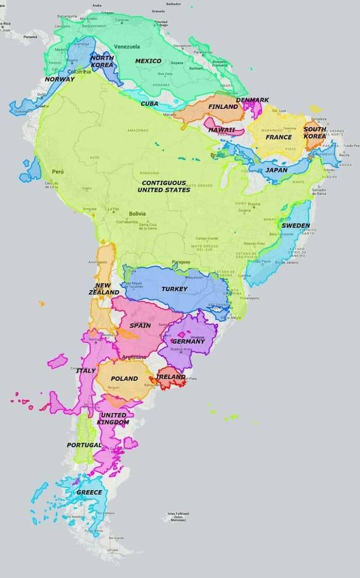
#28 South America Is Big
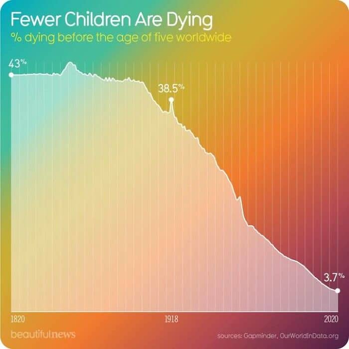
#29 One Of Humanity’s Greatest Achievements
#30 The Nearest Other Country…
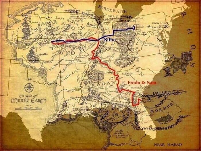
#31 Damn … How Far Bilbo And Frodo Actually Walked (If The Shire Is Kansas, Mordor Is Jacksonville)
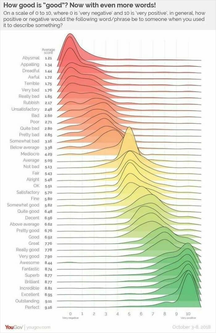
#32 Rubbish? Fine? Brilliant? British Superlatives Graded And Ranked
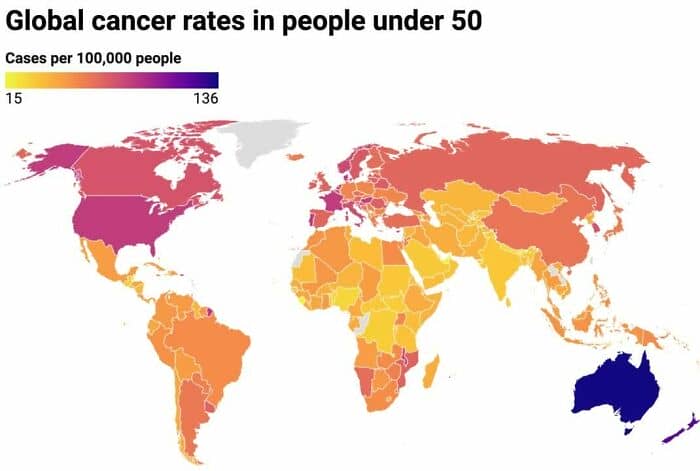
#33 Woah Australia – Global Cancer Rates In People Under 50
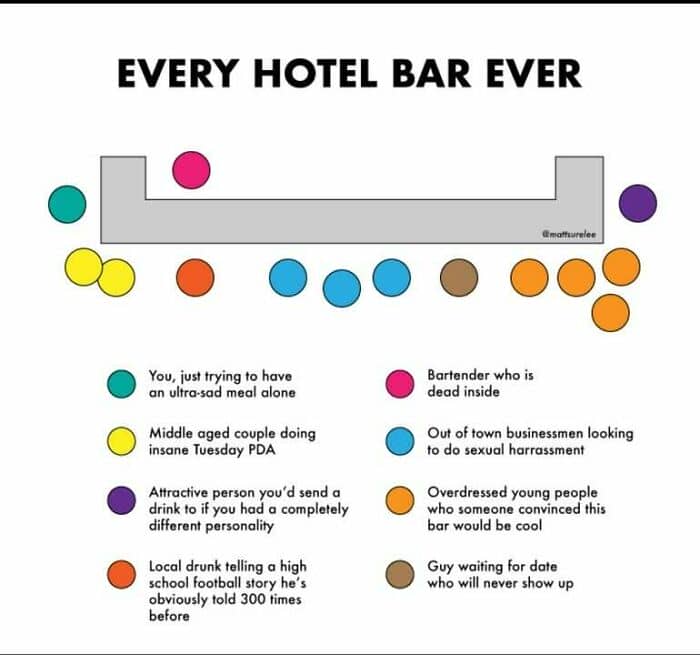
#34 Every Hotel Bar Ever
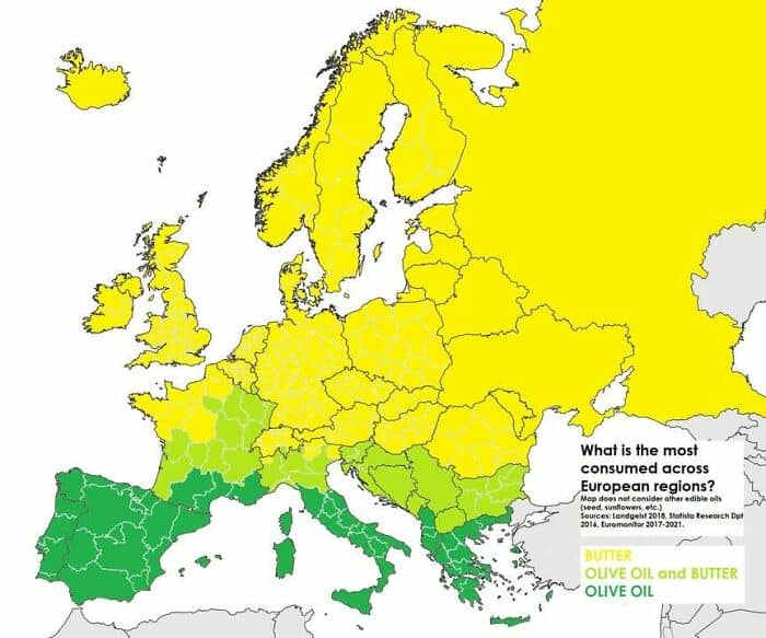
#35 Ever Heard Of The Butter Line?
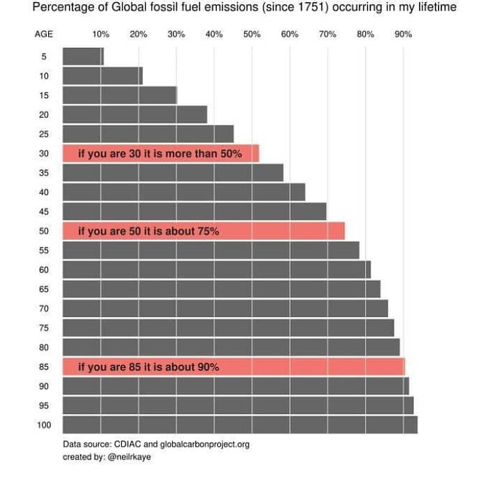
#36 If You’re Aged 30 Or More, Then 50% Of All Human Fossil Fuel Emissions Happened During Your Lifetime
#37 We Were Curious
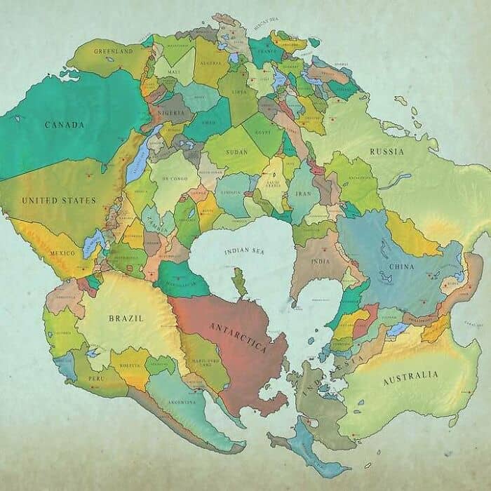
#38 How The World Will Look In 250 Million Years
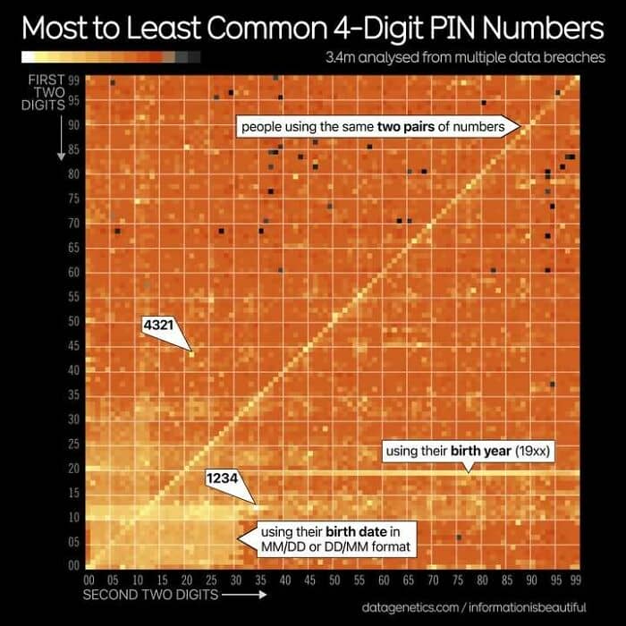
#39 Warning! This Image May Trigger Pinsecurity. From An Analysis Of 3.4m Pin Code Leaked From Several Data Breaches
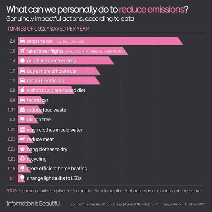
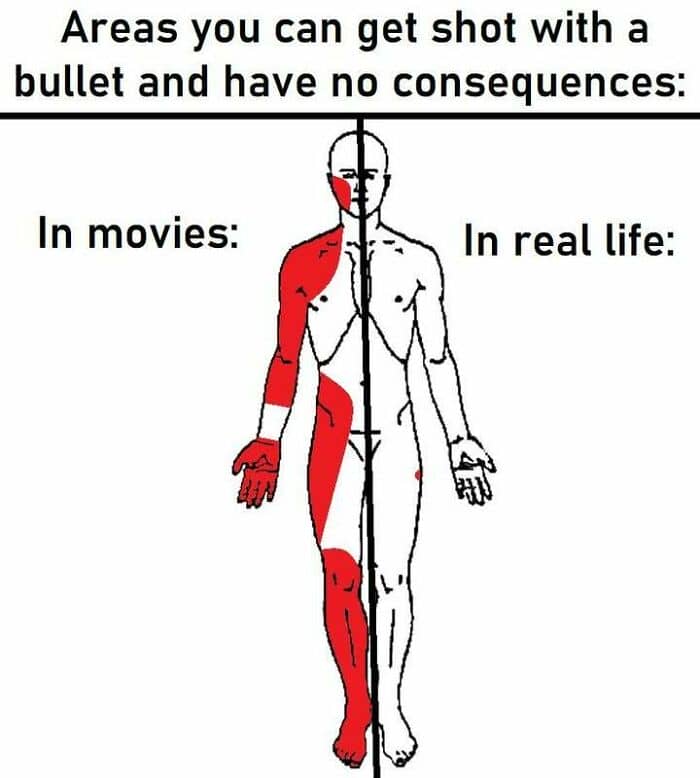
#40 What’s Actually Worth Doing To Make A Climate Difference, According To Data?
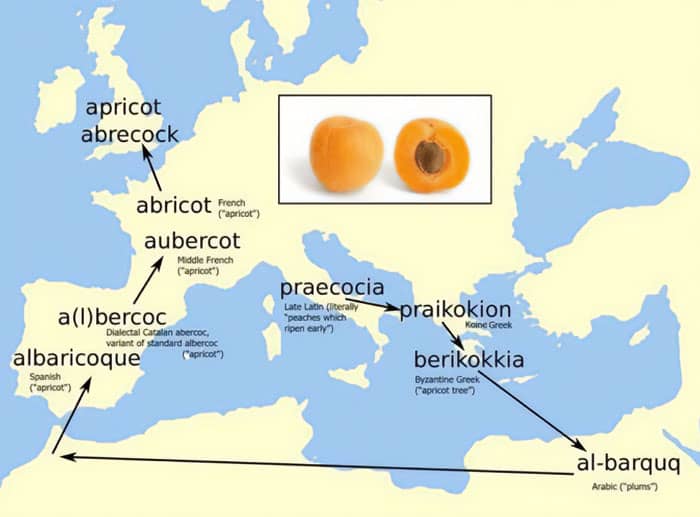
#41 Al-Barquq > Albercoc > Aubercot > Apricot
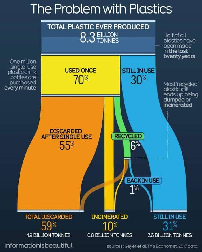
#42 Guess What % Of Plastics Have Been Recycled
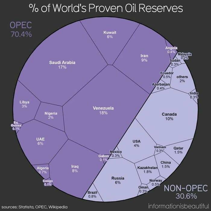
#43 Oil
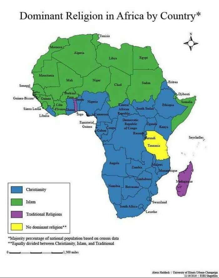
#44 Africa’s Most Dominant Religions
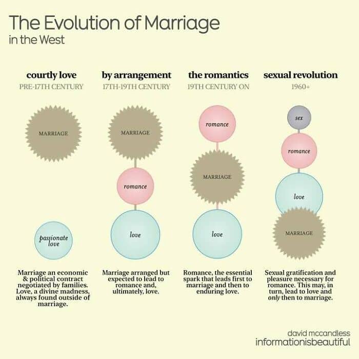
#45 How The Concept Of Marriage Has Changed Across Centuries
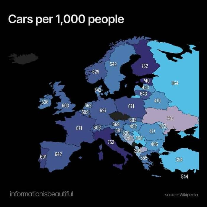
#46 Cars Per 1,000 Inhabitants
#47 Some Interesting Variations Here
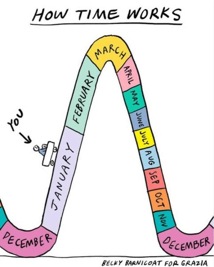
#48 Deep Truth
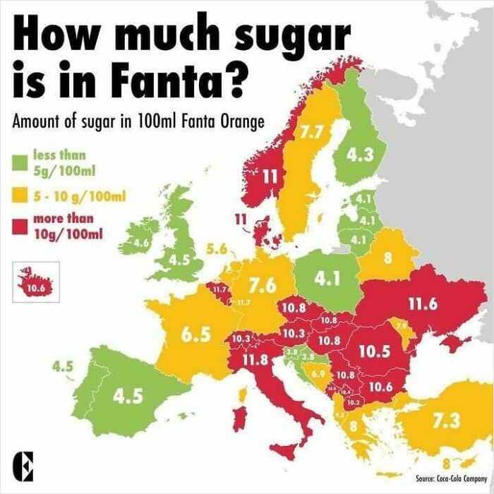
#49 Sweet Teeth In The East. How Much Sugar In Fanta
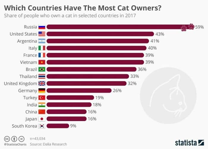
#50 Which Countries Have The Most Cat Owners? Maybe Not What You Expect
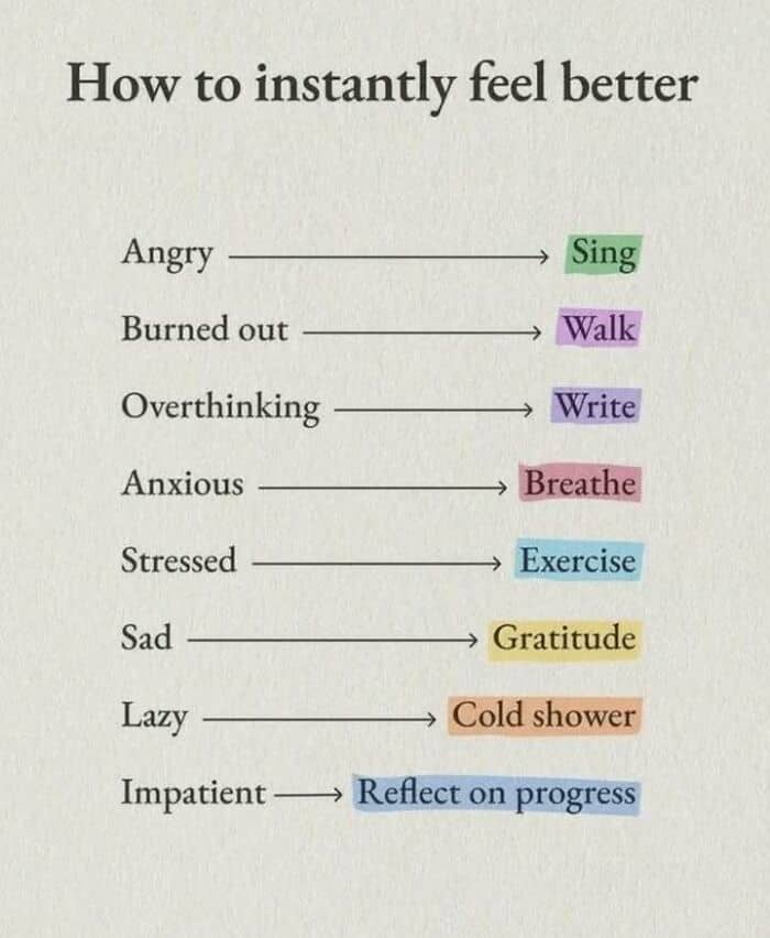
#51 Not Sure About “Cold Shower” But These Seem Like Intuitive Fixes
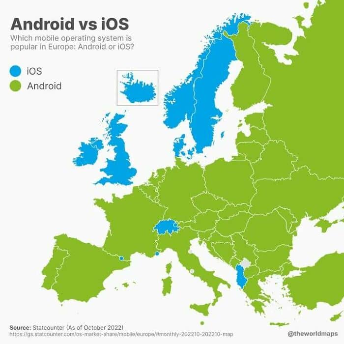
#52 The True Digital Divide In Europenote: Oct 2022 Data
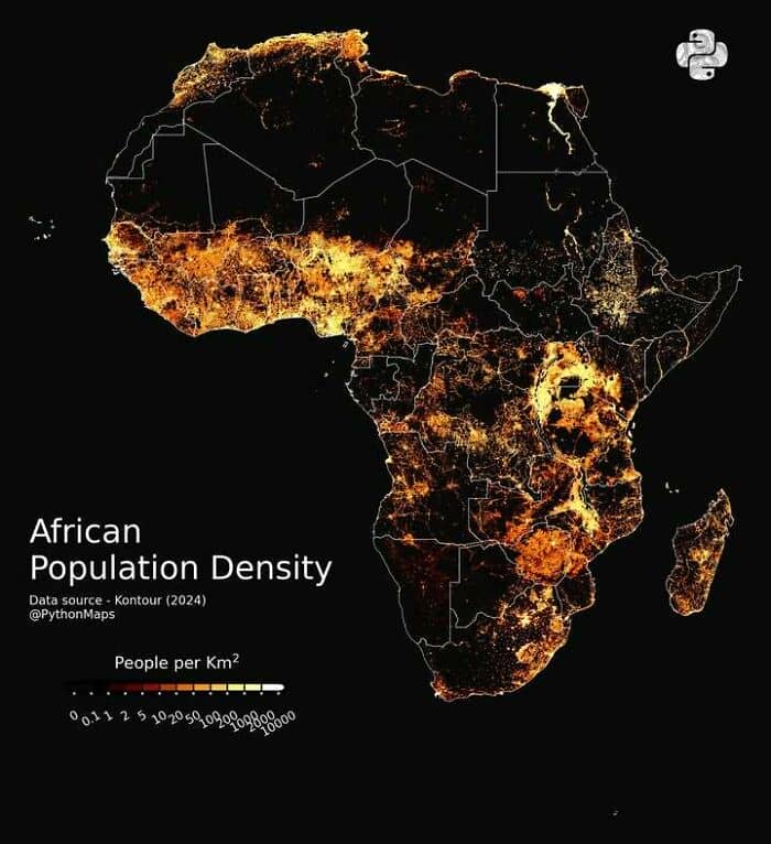
#53 Population Density Of Africa
#54 This Made Us Think
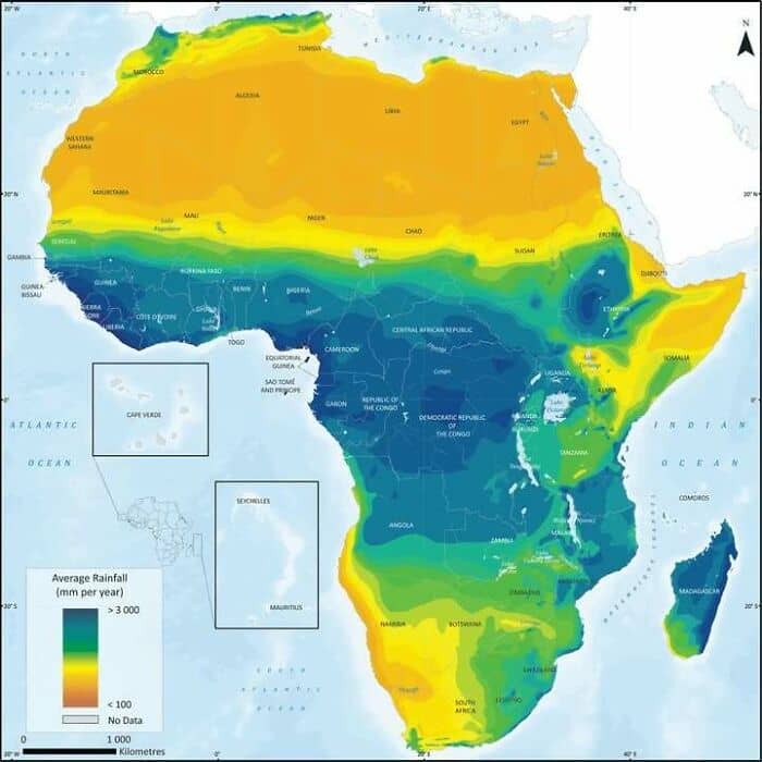
#55 Africa Rainfall Map
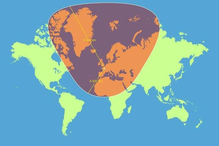
#56 Another Reasons To Tut At The Mercator Map Projection – How A Circle With A Radius Of 5,000km, Centred On Paris, Looks According The Mercator Map
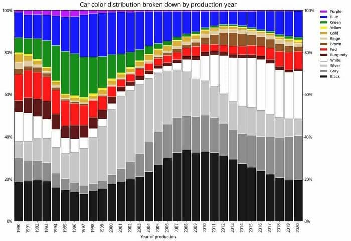
#57 Most Popular Car Colours By Year. Purple And Green Cars Rip. Note: Data From Poland.
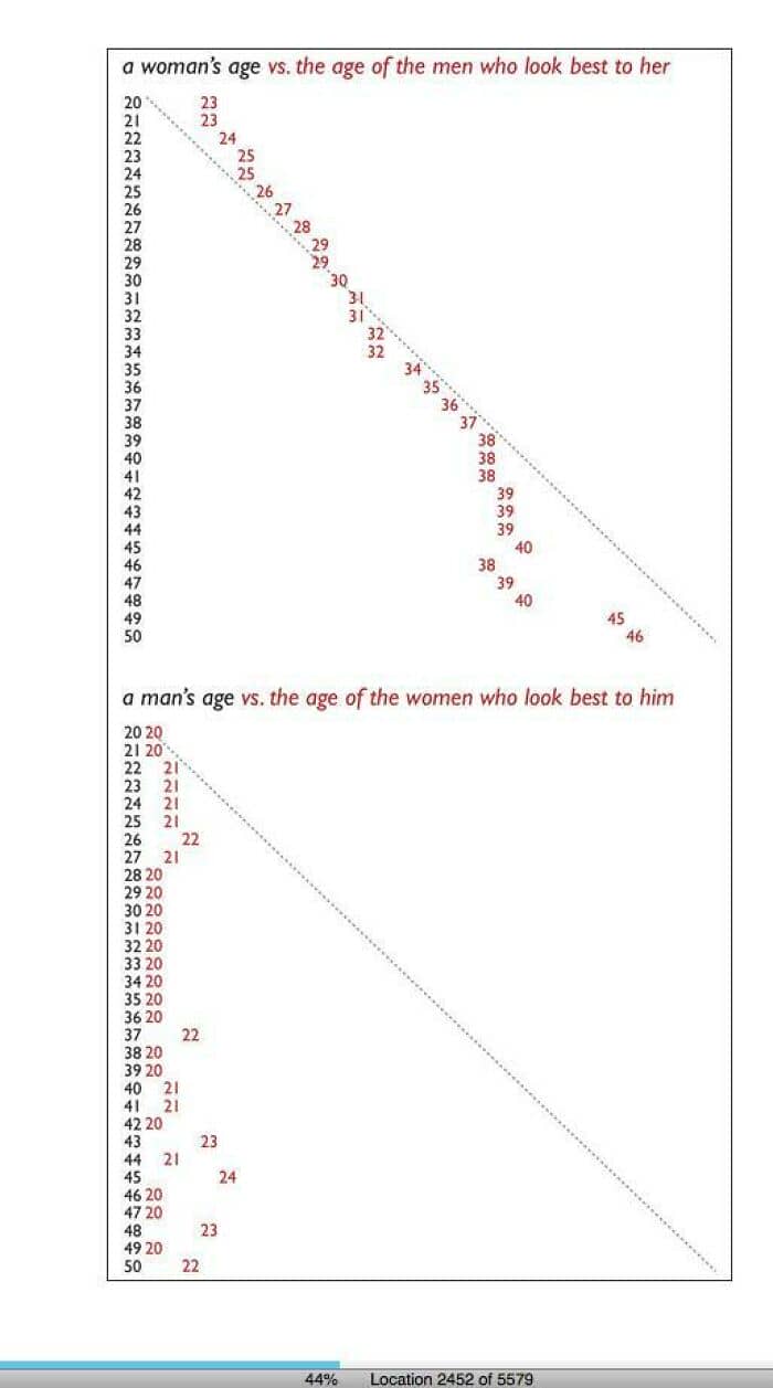
#58 A Woman’s Age vs. The Age Of The Men Who Look Best To Her vs. The Same Chart For Men
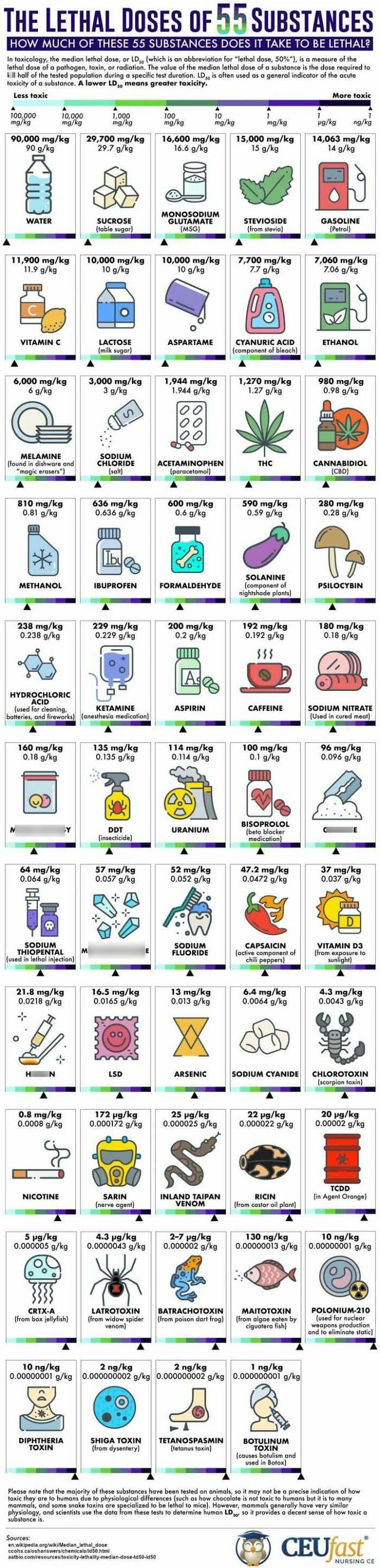
#59 The Lethal Doses Of 55 Substances
#60 Seems To Fit?
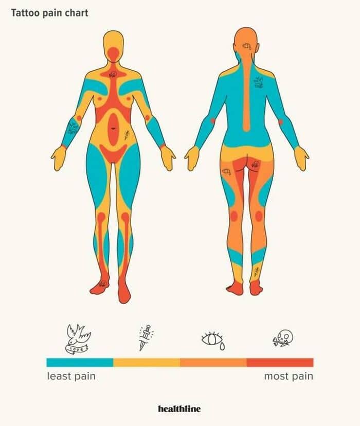
#61 Pain Is Temporary, Tattoos Are Forever
#62 Accurate
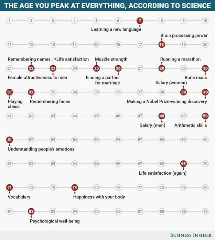
#63 The Age You Peak
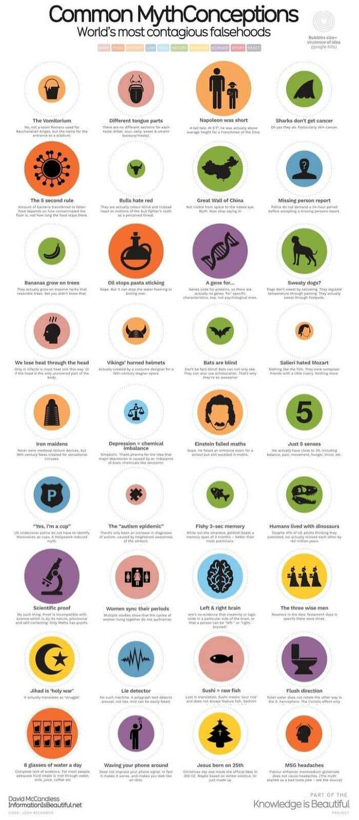
#64 World’s Most Contagious Falsehoods
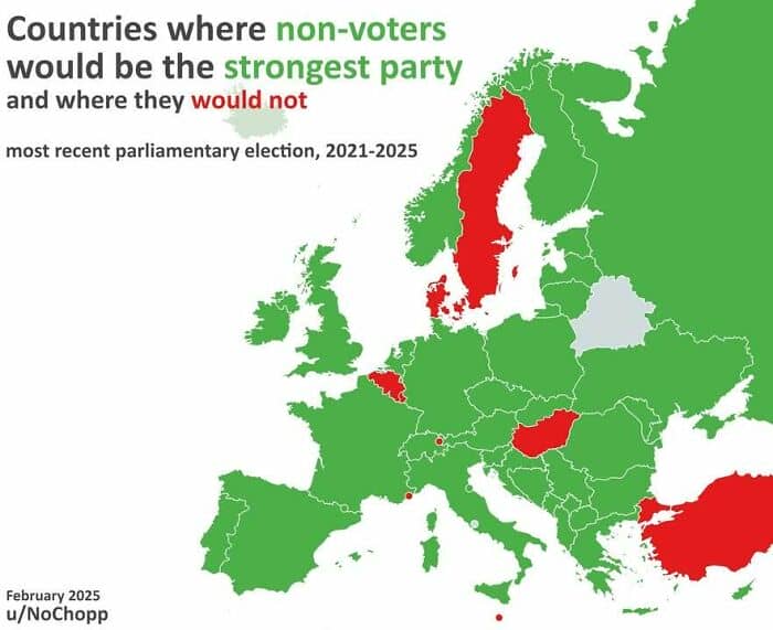
#65 Countries Where Non-Voters Would Be The Strongest Voting Bloc / Party
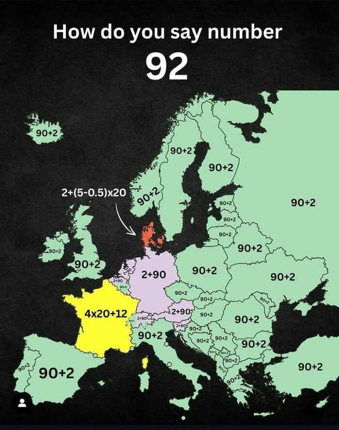
#66 How To Say The Number 92 In Various European Languages
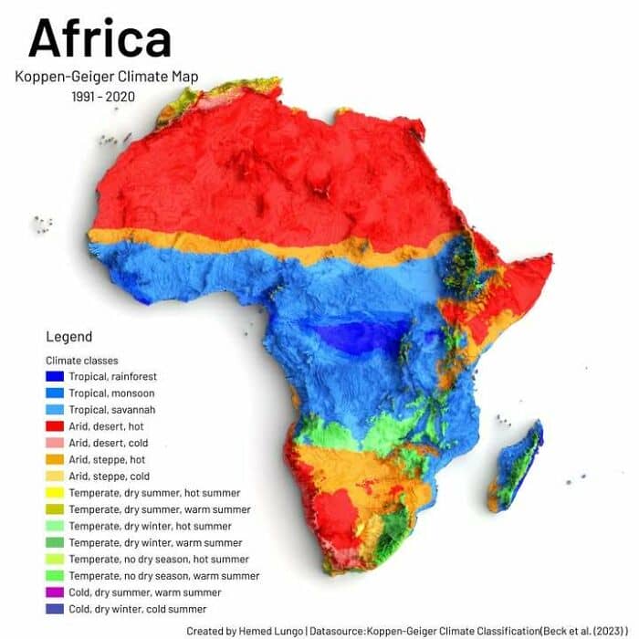
#67 The Climate Colours Of Africa
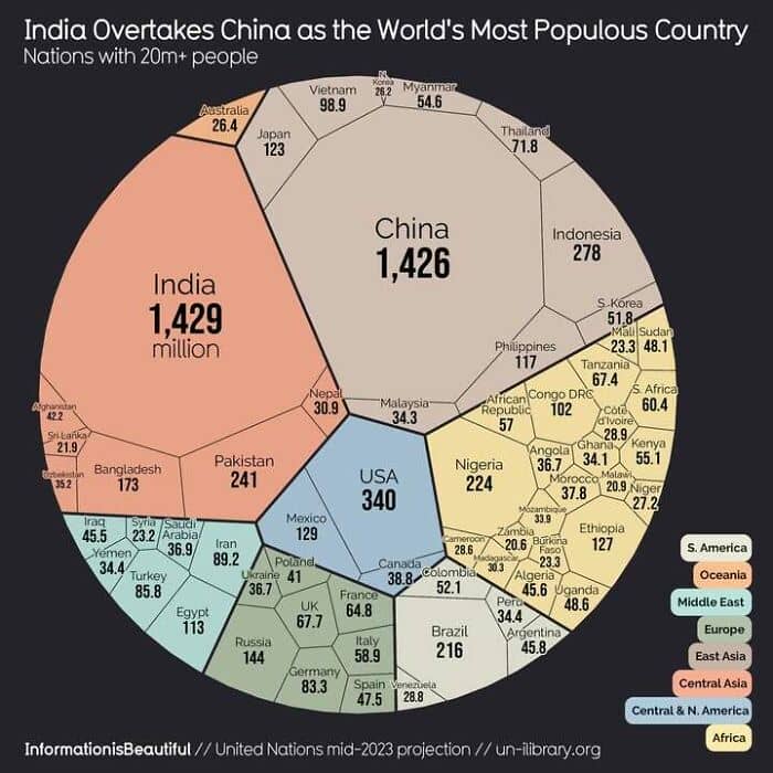
#68 World Population Visualized
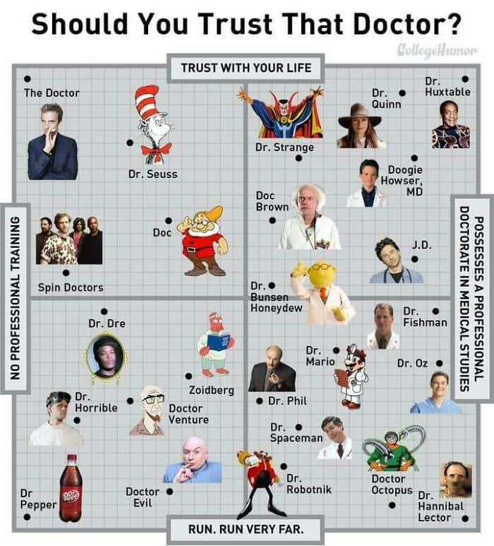
#69 Should You Trust That Doctor? (Maybe More Relevant Today Than Ever)
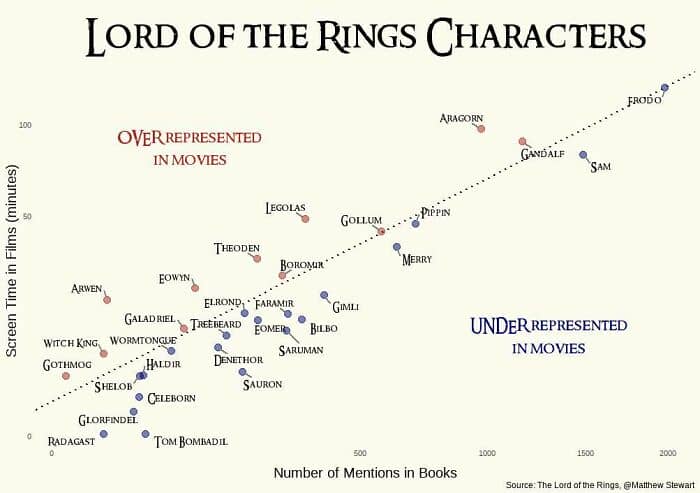
#70 Lord Of The Rings Characters: Screen Time vs. Mentions In The Book. The Further From The Dotted Line, The Further Off Trend
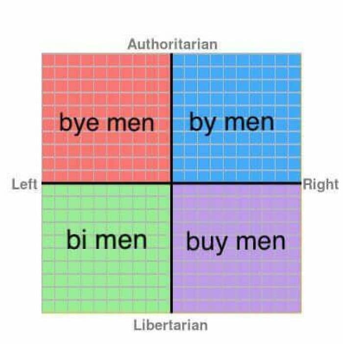
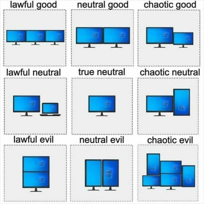
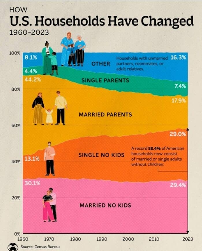
#71 How The Makeup Of Us Households Have Changed 1960 vs. Today
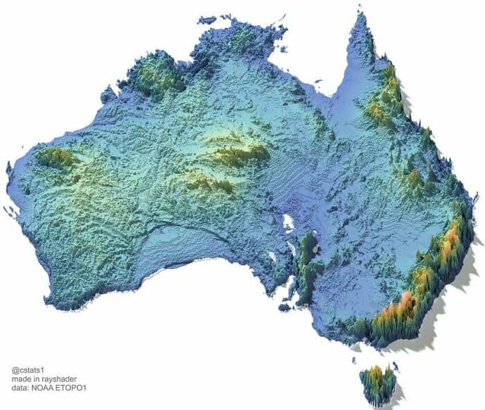
#72 Didn’t Realise That About The East Coast… Topographical Map Of Australia
#73 This Feels True
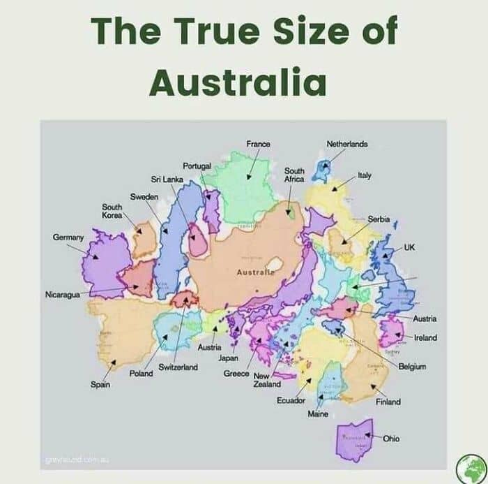
#74 Australia Is Big
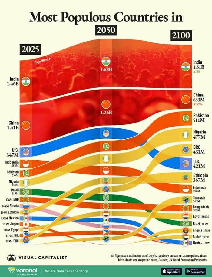
#75 Demographic Time Bombs Ahoy! Woah China.
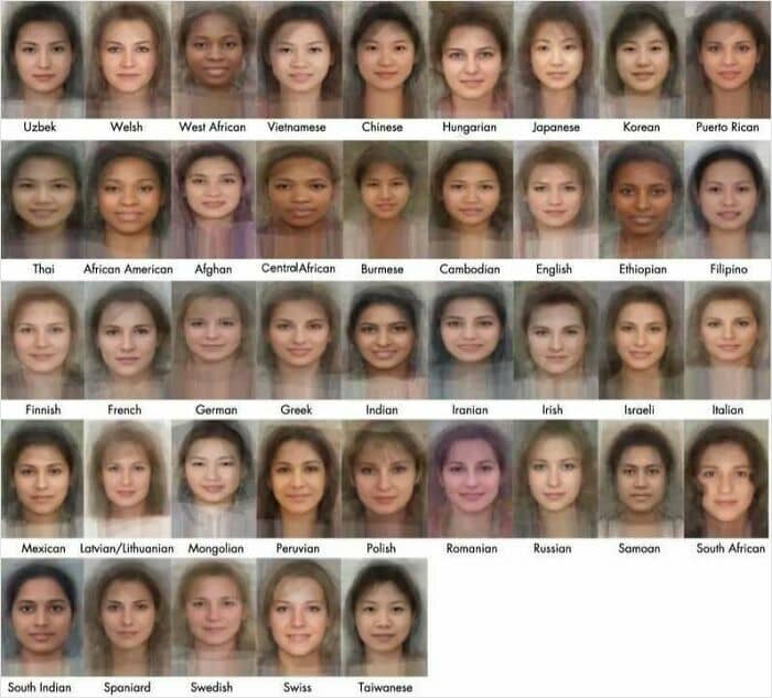
#76 Faces Of Women, Averaged From Thousands Of Photos
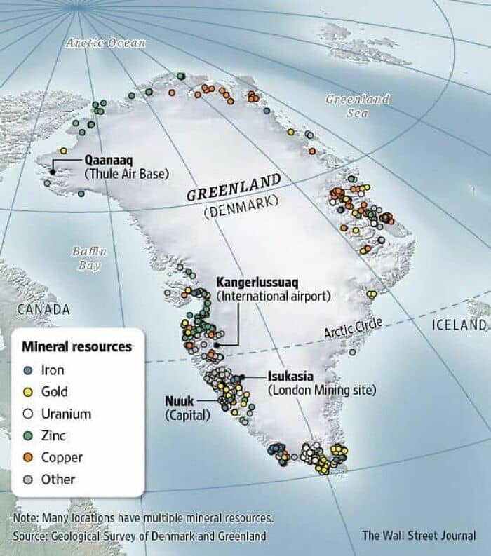
#77 Hmmm. Greenland Possesses Significant, Largely Untapped, Mineral Resources, Inc. Rare Earth Elements, Graphite, Lithium, And Other Critical Minerals
#78 Checks Out
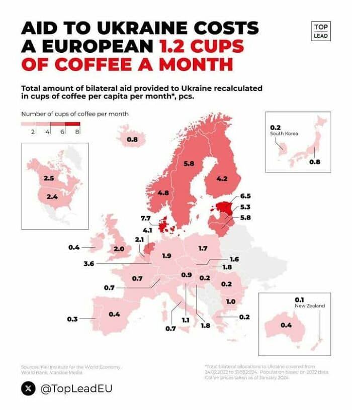
#79 Interesting Reframing. Cost Of Aid To #ukraine In Cups Of Coffee Per Month
#80 A Spot In The Gurbantünggüt Desert Approximately 320 Km (200 Mi) North Of The City Of Ürümqi, In Xinjiang Region, China, Is (Likely) The Farthest Point In The World From Any Coast
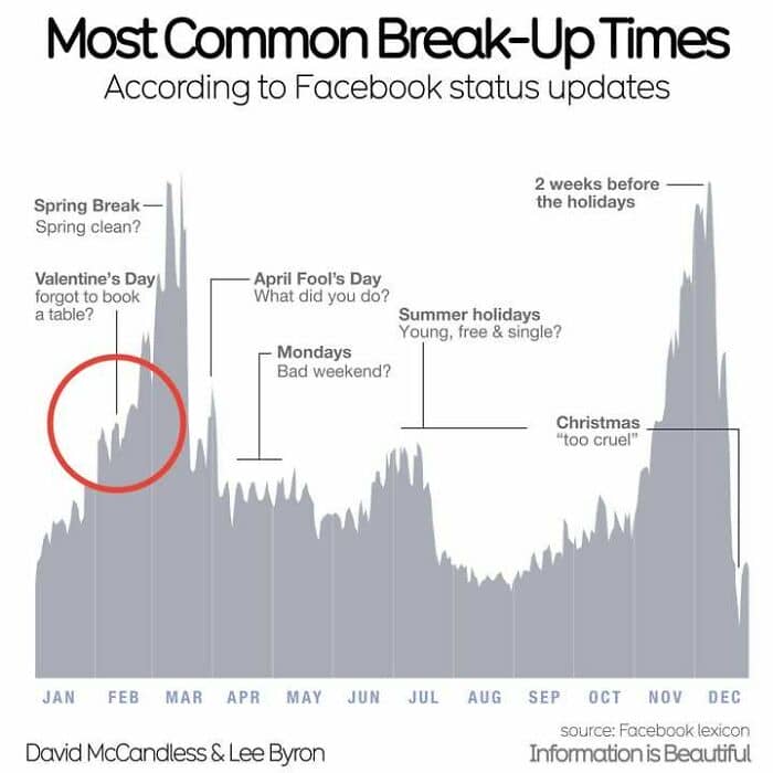
#81 Be Careful Valentines!
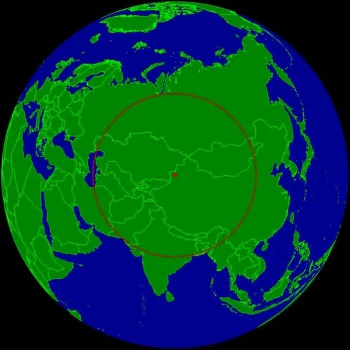
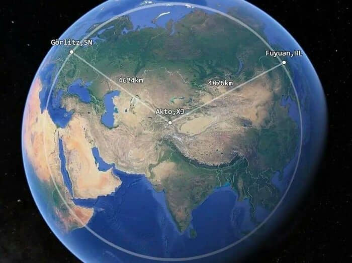
#82 China’s Westernmost Point Is Closer To Germany Than To Its Easternmost Point
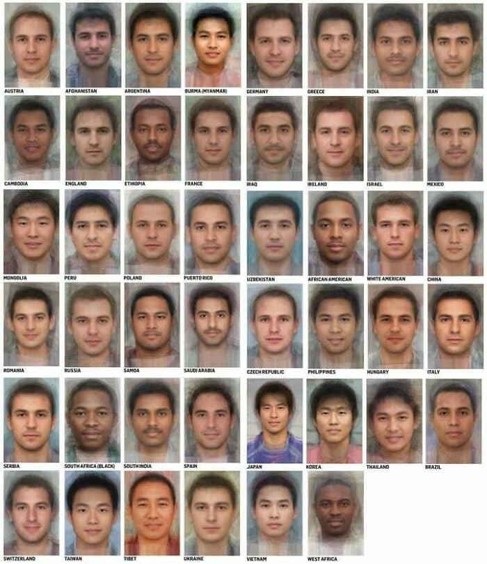
#83 Faces Of Men, Averaged From Thousands Of Photos
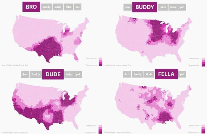
#84 Dude, Bro, Buddy, Fella
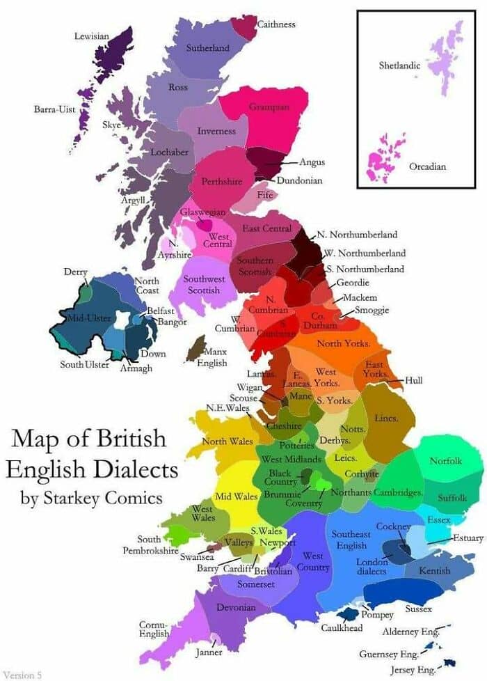
#85 UK Dialect Map
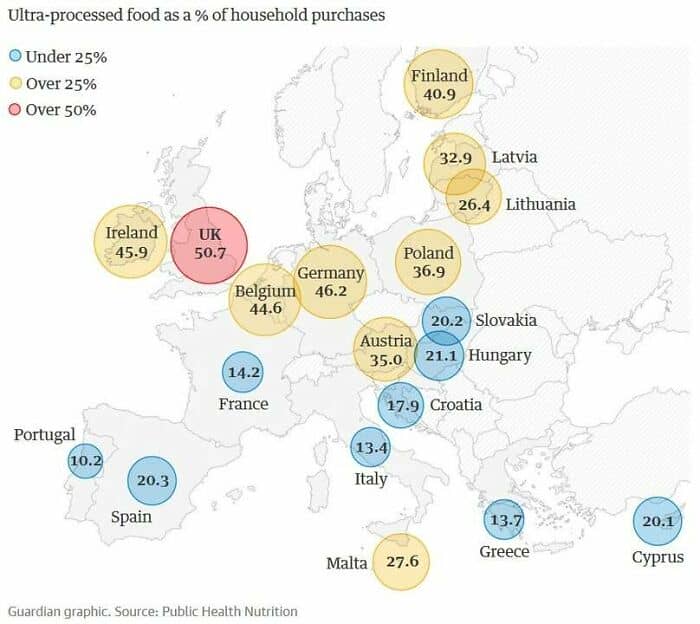
#86 Consumption Of Ultra-Processed Foods (Upfs). Wtf UK?
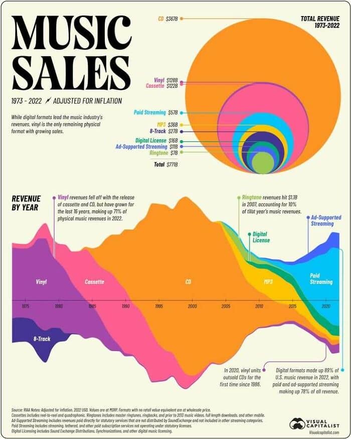
#87 Music Sales By Format From 1973+
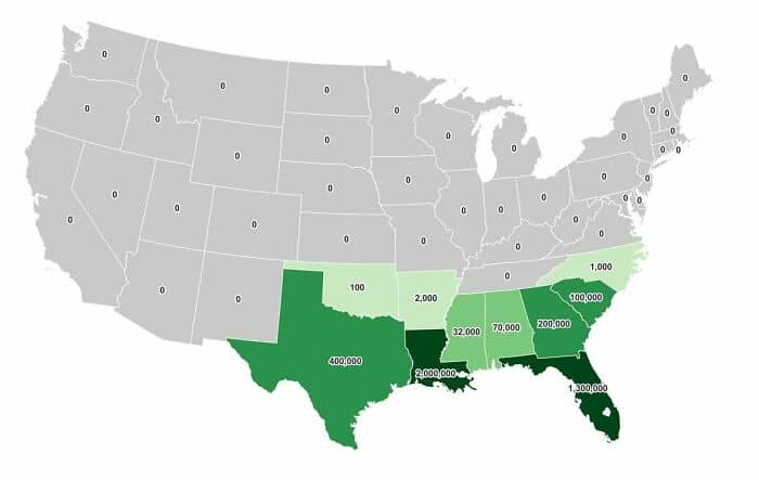
#88 Alligator Population By State… Good To Know!
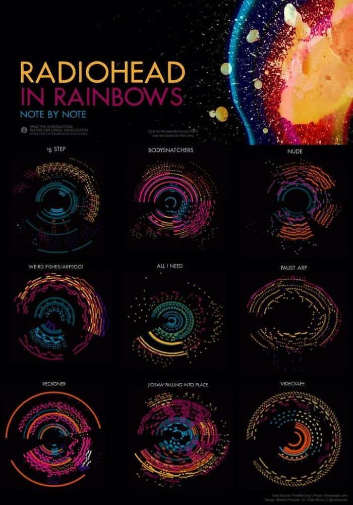
#89 Really Liked These Radiohead Song Visualisations, Using Midi Data & Colour Intensities To Give Each Song A Beautiful Digital Signature
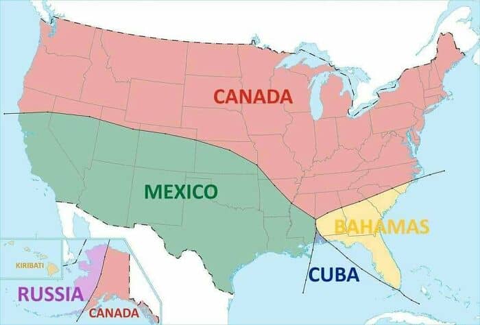
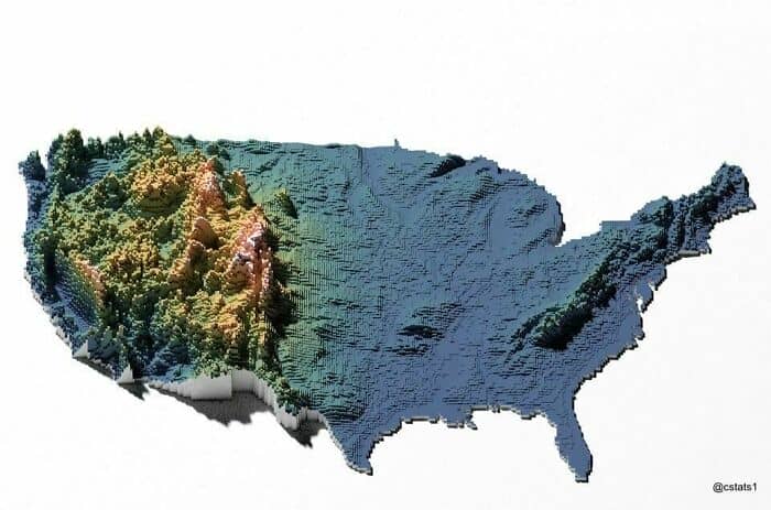
#90 A Different View Of The USA
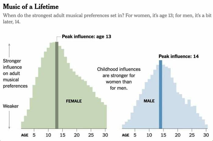
#91 Love It As A Teen, Love It Forever
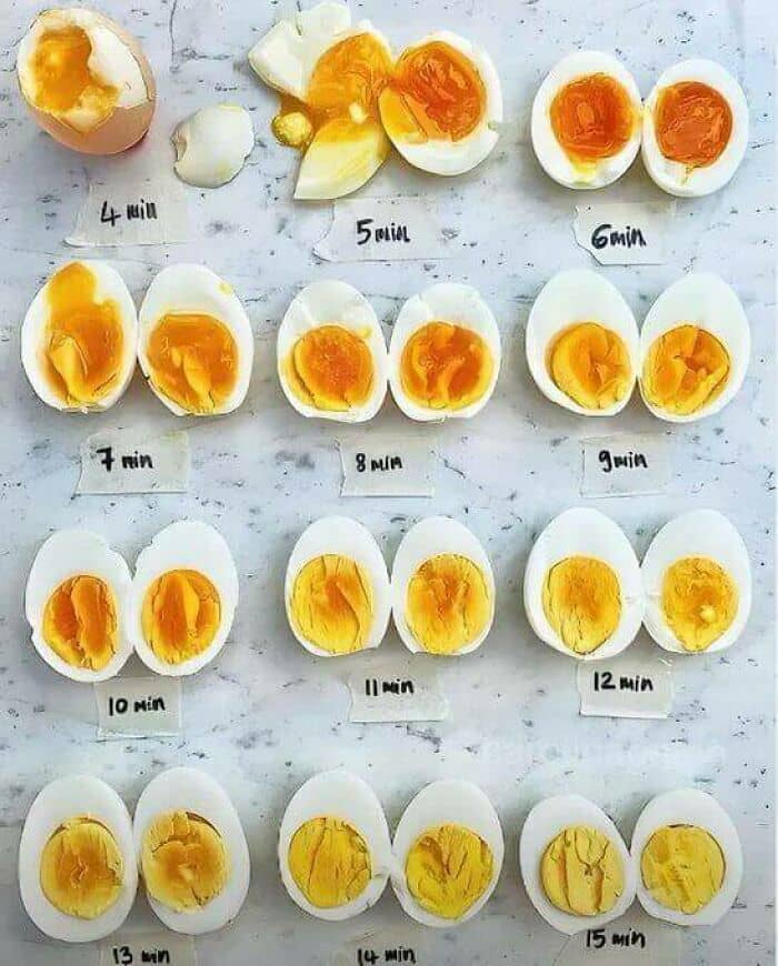
#92 Simple Egg-Boiling Chart. If You Can Afford Them
#93 A Different Manifestation Of The Political Compass