They say you shouldn’t judge an album by its cover, but we’re about to throw that rule out the window. Good album art is the visual sneak peak for the music within, a promise of what’s to come. But for some artists, that strategy falls horribly on its face.
Internet users have journeyed into the deepest, dustiest corners of music history to unearth 45 covers that are not just bad, they’re legendary disasters. From baffling photoshoots and cringeworthy fashion to some truly bizarre creative choices, this is a gallery of what happens when a good idea goes horribly wrong. Prepare to laugh, cringe, and ask, “Who approved this?”
More info: Reddit

#1

Black Tarrzann by Cappadonna I picture him setting up a tripod in his local park, squatting in front of the tree trying to look cool and then going home and editing in the animals in Microsoft paint.
#2
So bad that they had to cover it up 😝.
#3
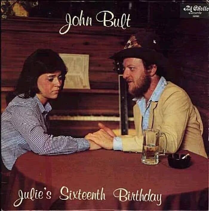
Julie’s Sixteenth Birthday
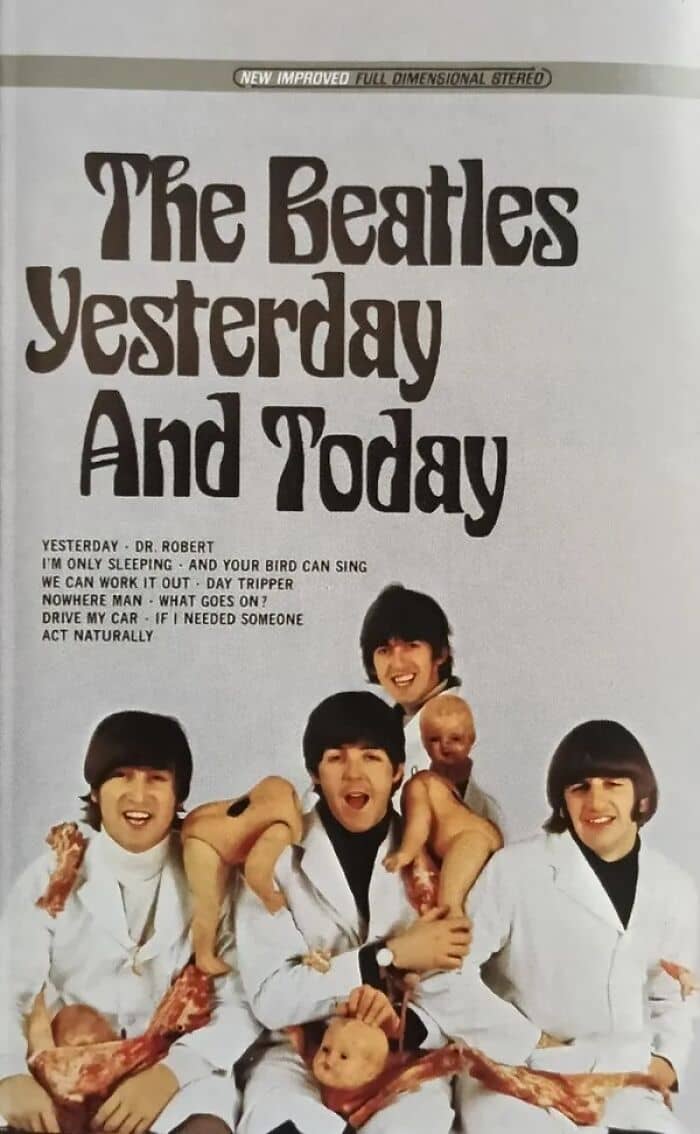
Sometimes, a terrible cover is born from a genuinely bold artistic statement that just doesn’t land. The most notorious example is The Beatles’ original 1966 cover for their American album Yesterday and Today. Known as the “Butcher Cover,” it featured the Fab Four in white butcher coats, smiling gleefully while covered in raw meat and decapitated baby dolls.
It was meant to be a surrealist protest against the way their American label, Capitol Records, was “butchering” their albums for release. Needless to say, the public was horrified. The label immediately recalled an estimated 750,000 copies, frantically pasting a new, bland photo of the band over the offending image.
It was an expensive, embarrassing lesson that even the biggest band in the world can misread the room so badly that their artistic vision ends up in a landfill. Original “Butcher Covers” are now priceless collector’s items.
#4
This one from Corey Feldman or the 2007 one from Ted Nugent that got pulled by the label before release.
#5
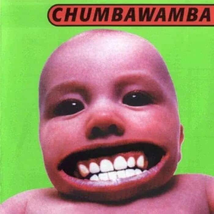
Tubthumper by Chumbawamba
No matter how much I age, i’ll always be scared of that thing.
#6

Someone posted human clay, I raise you this masterpiece
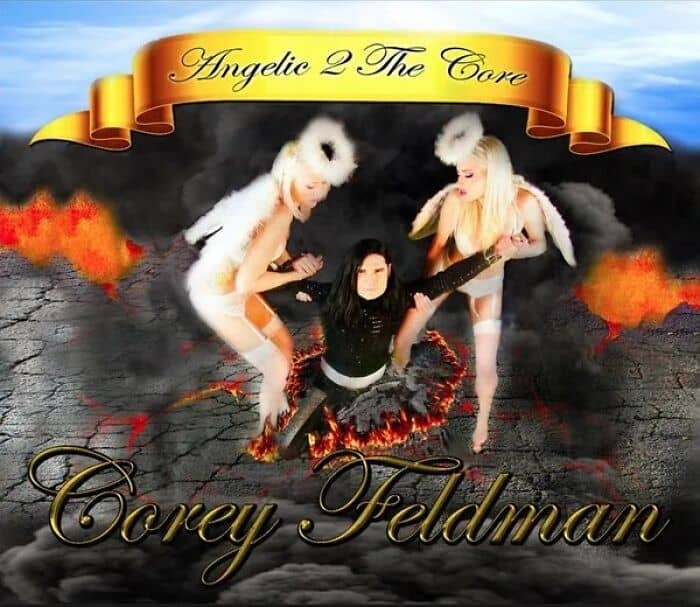
Then you have the modern masterpieces of cringe, covers so baffling they demand respect. Look no further than Corey Feldman’s 2016 opus, Angelic 2 the Core. The cover is a Photoshop fever dream of Corey in a messianic pose, flanked by his lingerie-clad “Angels” against a clip-art heaven. It is a work of such profound, unwavering sincerity that it loops past bad and becomes a piece of outsider art.
On the opposite end of the spectrum is the sin of laziness, perfected by two of the biggest artists on the planet. Kanye West’s The Life of Pablo looks like it was made on a meme generator in five minutes, while Drake’s Certified Lover Boy is literally just a grid of pregnant lady emojis. When you’re that famous, you can apparently get away with anything, including turning in a group text for your album art.
#7
Iconic now but I legit bought the deluxe edition because of how much I hated this album cover at the time. Marketing genius tbh
#8
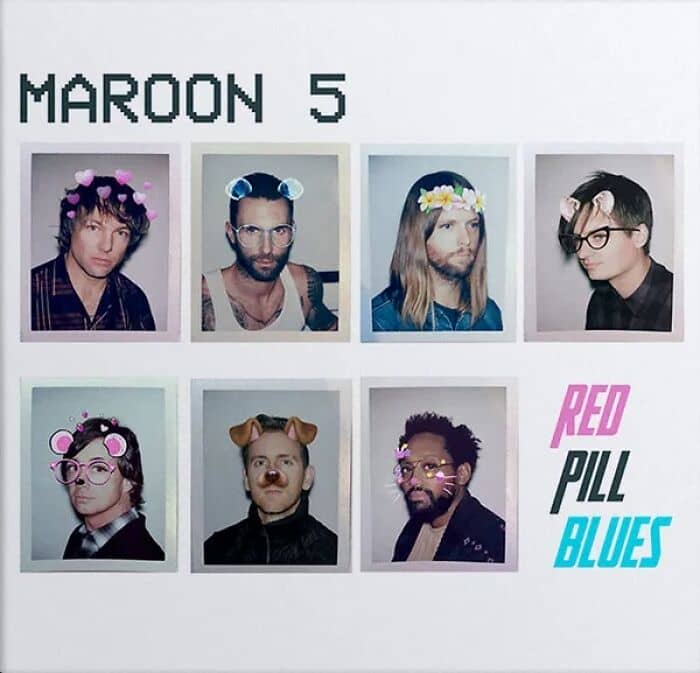
There are 7 people in Maroon 5?
#9
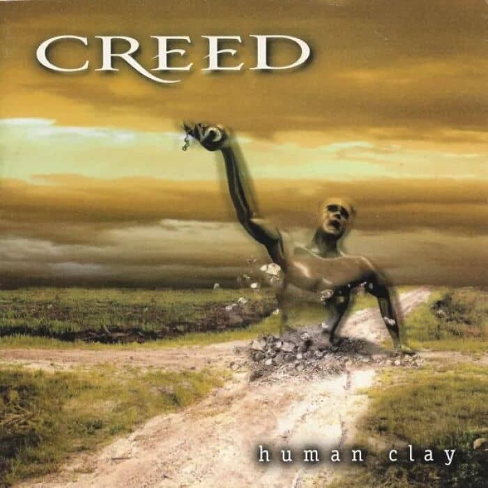
Human Clay by Creed – like WHAT?
A special place in the hall of shame is reserved for covers that are just plain gross. For years, people have looked at the cover of Metallica’s Load and seen a fiery, abstract pattern. The truth is much, much worse. The piece, created by artist Andres Serrano, is a photograph titled “[Bodily fluids] and Blood III.”
And yes, it is exactly what it sounds like: bovine blood and the artist’s own fluids pressed between two panes of glass. Suddenly, the album’s title feels a lot more uncomfortable.
But if abstract body fluids aren’t your thing, there’s always the literal, visceral horror of Three Dog Night’s Hard Labor. The cover features woman in labor and it was deemed too explicit, with later editions having a big bandaid plastered over it. It’s less “rock and roll” and more “medical textbook nightmare.”
#10

Just not it
#11
it’s really not that bad but my brother had this album growing up and it freaked me out so bad i couldn’t even touch it!! i vividly remember a time he left it by the family computer and i made him come get it because i was too scared to move it lmao.
#12

Any of viper the rapper’s thousands of albums.
No artist can ignite a cultural debate quite like Taylor Swift, and the artwork for her upcoming album,The Life of a Showgirl, proved to be a masterclass in division. The provocative, showgirl-inspired theme was revealed, and the internet promptly split into warring factions. The cover was designed to reflect the off-stage moments of her larger-than-life tour. However, the reaction was anything but calm.
On one side, a vocal group of critics and even some fans deemed the imagery inappropriate, questioning her as a role model for a younger audience and flooding social media with outrage. On the other side, a completely different argument emerged: that the look wasn’t daring enough and was merely imitating the established aesthetics of artists like Chappell Roan and Jennifer Lopez.
Caught in the crossfire, Swift managed to create a cover that was simultaneously too seductive for some and not original enough for others, proving that even a single image can become a battleground for cultural expectations.
#13

Certified Lover Boy Drake.
#14
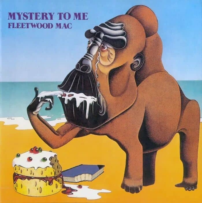
I’m not a fan of Fleetwood Mac’s “Mystery to Me”, and David Bowie’s “Toy”.
#15

Crosby Stills and Nash – Live It Up.
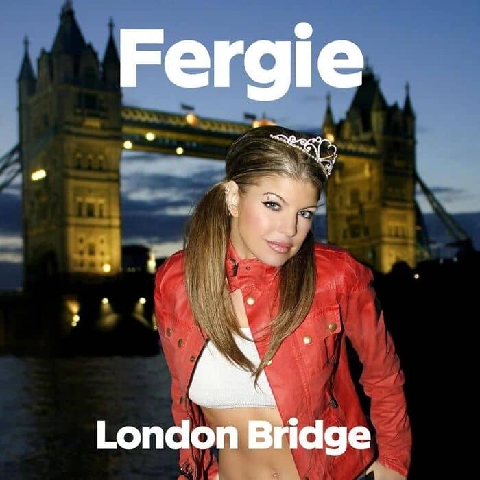
Sometimes, a cover fails on the most basic level: geography. On the artwork for her 2006 single “London Bridge,” Fergie stands proudly in front of a famous London landmark. One small problem: that’s Tower Bridge. It’s a common mistake, but one you’d think a multi-million dollar production team might have caught. It’s the visual equivalent of singing a love song to the Eiffel Tower while standing in Rome.
Finally, we have the covers that try so hard to be serious, they end up becoming legendary jokes. Creed are the undisputed kings of this category. Both Human Clay and Weathered are monuments to nu-metal self-importance, featuring dramatic poses, sepia tones, and enough angst to power a small city. They are so aggressively earnest that they feel like a parody, but it’s why we love/hate them.
Have you spotted any “too terrible to be real” album covers lately? Share them with us in the comments below! After all, a cringe shared is a cringe halved, or something like that!
#16
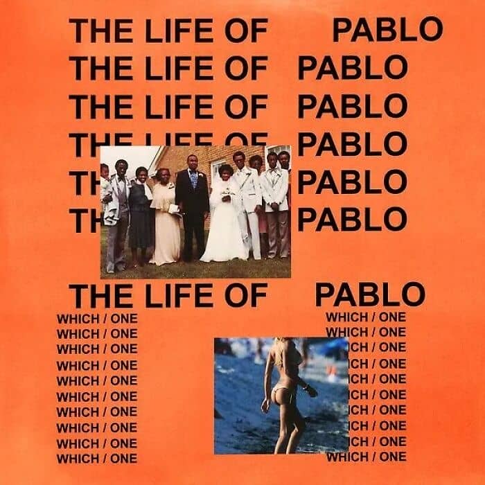
Kanye West- The Life of Pablo.
#17
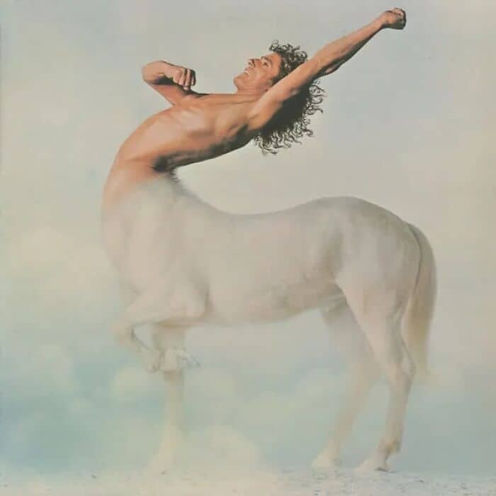
Roger Daltrey: Ride a Rock Horse.
#18

Well….
#19
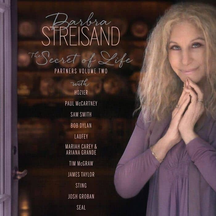
Barbra Streisand x Fly Screen.
#20
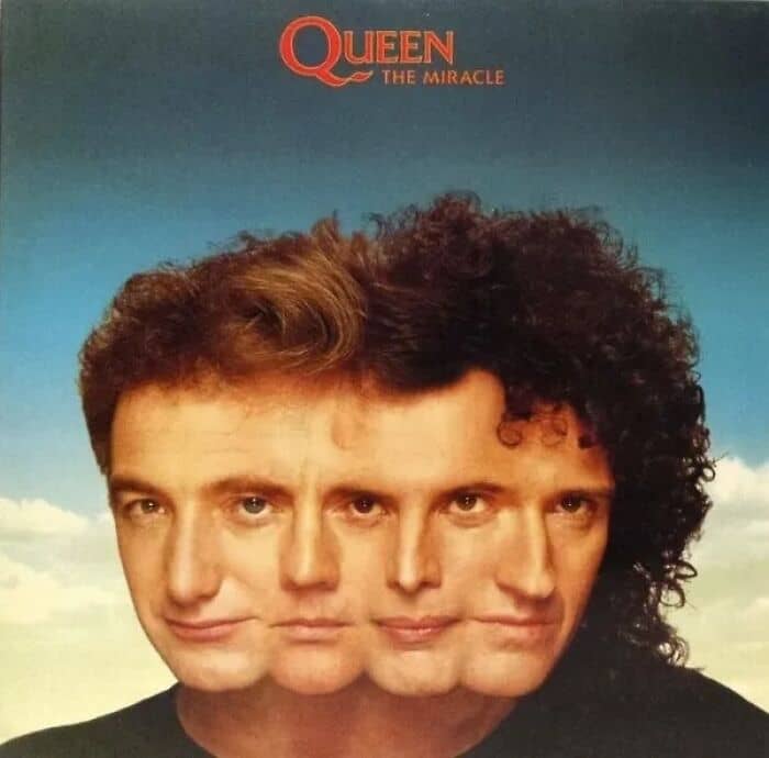
This atrocity by Queen
#21
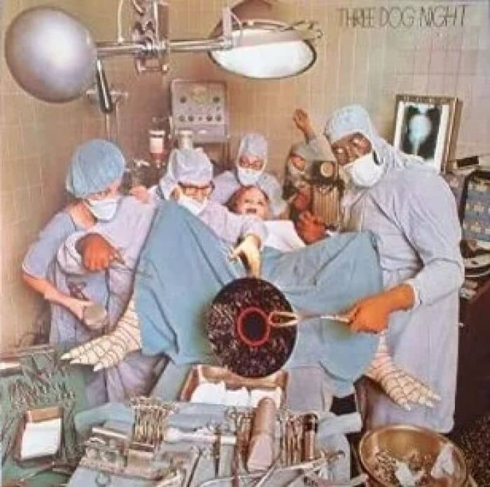
Three Dog Night- Hard Labor.
#22
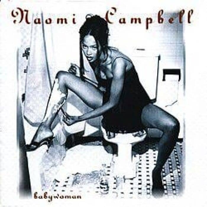
I will never understand why Naomi Campbell chose this as the cover of her 1994 debut (and only) album. Obvs she still looks great bc duh but the concept is just so ??? and the album name Babywoman is so f*****g weird.
#23
do single covers count?
#24
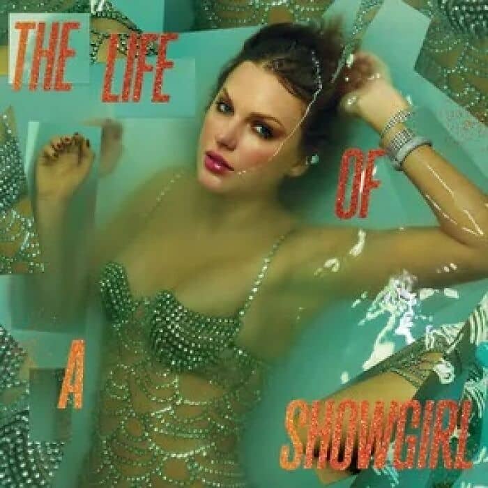
The Life of a Showgirl, 2025.
#25
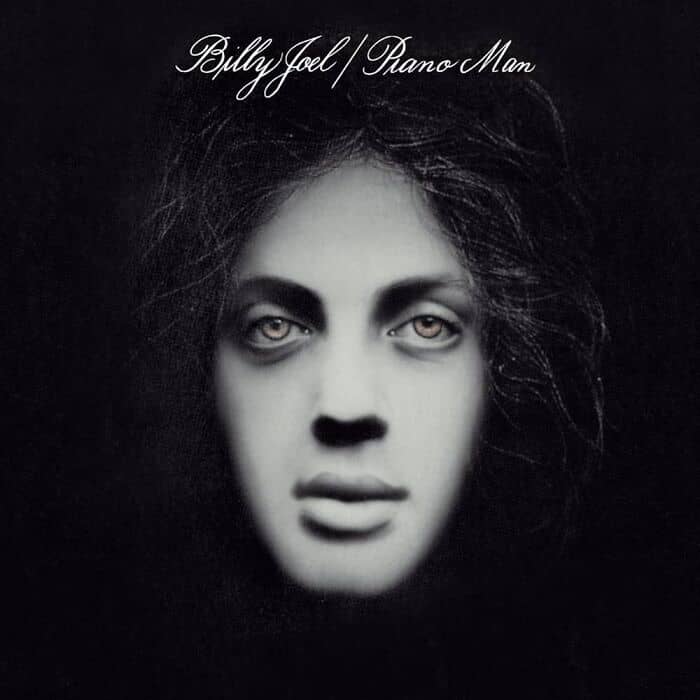
Piano Man by Billy Joel
[The back cover](https://images.45cat.com/f/cd/billy-joel-piano-man-3-cd.jpg) is just as bad.
#26
Maybe not the worst, but this one sure is icky.
#27
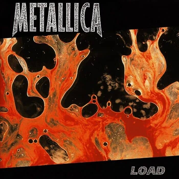
“The cover artwork is an abstract painting by artist Andres Serrano created by mixing blood and his own [bodily fluids].”.